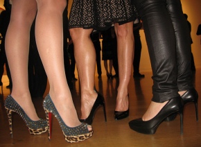
Peripheral Vision

Spectacular, Spectacular: Venice, Vegas, and the A-Y-P Expo

June 17, 2009 · Leave a Comment

On Artsbeat, Randy Kennedy recently recounted a Kafkaesque experience receiving his press credentials at the Venice Biennale:

“The words ‘grande confusione’ are often heard. They were running through my head as a woman told me I was in the wrong place and that I should walk to the Arsenale, the other site for the event, several blocks away. They were in my head again when a woman at the Arsenale told me I was at the wrong entrance and needed to walk to the other end of the blocks-long building. Here, they could discover no record of my existence – but they looked me over warily, eyeballed my credentials and grudgingly wrote out a pass for me anyway.”

Out There: Architeture Beyond Building, Venice Biennale 2008, image by dysturb

Not being a member of the press, I don’t know how common this feeling might be; in my mind, it evoked one of the most memorable press check-in scenes in modern literature:

“My legs felt rubbery. I gripped the desk and sagged toward her as she held out the envelope, but I refused to accept it.  The woman’s face was changing: swelling, pulsing…horrible green jowls and fangs jutting out, the face of a Moray Eel! Deadly poison! I lunged backwards into my attorney, who gripped my arm as he reached out to take the note.” (Hunter S. Thompson, Fear and Loathing in Las Vegas 23)

Fear and Loathing in Las Vegas (Terry Gilliam, 1998).

Hunter S. Thompson’s vividly drug-induced scene is the most appropriate way to begin their spectacular journey to the Mint 400 race in Las Vegas. If nothing else, an experience on the Las Vegas Strip is one of pure spectacle, burying the spectator in disproportionately large hotel facades, casino-specific air scents, and flashes of LED screens (or neon in Old Vegas). It is inevitably Dave Hickey who captures the essence of Las Vegas-brand spectacle best in an introduction to the photography-focused The Book on Vegas:

“There is…this gorgeous life you feel in the pit of your stomach as you step out onto the Strip in the cool midnight air. I call it the “Vegas effect. It is all about colored light in atmospheric space–extremely vivid colored light in a very large, dark space, a little bit like stepping into the middle of an acid-drenched constellation–and photographs can’t do that…They can capture the space at the expense of the color or the color at the expense of the space, but if you want both, you have to be there.” (”Deciding About Las Vegas” 27)

In other words, Las Vegas is the obvious culmination of spectacle.

Although distinct in many respects, including content and intent, biennials typically have their own forms of spectacle; elements of unexpected scale, and the extreme are some of the vehicles for spectacle I recall from works in New Orleans’s Prospect.1 and the Whitney Biennial.  Although such events do not always make for astute journalism, it is rare to have a noteworthy spectacle without the presence of the press.

The Mint, Downtown Las Vegas, 1970, image from Photos Las Vegas.

As the first on the scene, the press can signify the beginning of a journey into a spectacle, which may offer some insight into the unique press credentials experiences described by Kennedy and Thompson.  After this period of initiation, the spectacular occurrence begins.  In the instance of multi-day events such as an art biennial or a weekend in Las Vegas, this can become a pilgrimage of spectacle: a series of stops, sites and way-finding amidst a saturation (or over-saturation) of the senses.

This summer, Seattle is reconsidering its own historical spectacle: the Alaska-Yukon-Pacific Exposition of 1909.  Similar to its previous incarnation, the current A-Y-P event requires a pilgrimage around town to various sites, including 4Culture, the Museum of History and Industry and the UW campus, the original site of the A-Y-P  Expo (a journey itself for Seattle’s residents in 1909).

Display of Southern California fruits, Alaska-Yukon-Pacific Exposition, 1909, image from Wikimedia Commons

Expositions were a regular source of spectacle for late 19th and 20th century citizens.  The A-Y-P Exposition had its fair share of this, ranging from a race of 55 Model T’s from New York to Seattle to the disturbing use of indigenous people as scenes in the fair’s displays.  Eventually becoming the buildings for some of America’s museums, including the Museum of Science and Industry and the Pacific Science Center, expos impacted the viewing of objects throughout American history, and to a certain extent, continue to do so; this is demonstrated by traveling blockbuster exhibitions that rely on spectacle through perceived exoticism (King Tut), shock (Body Worlds) and mainstream popular culture (Titanic). Not surprisingly, two of the three blockbuster shows listed have semi-permanent homes in Las Vegas casinos.

Grand staircase replica, Titanic: The Artifact Exhibition, image by sgurr.

Thus far, the only location of the current A-Y-P exhibition I visited is Gallery4Culture, which houses 100 years…For better or worse, featuring the work of lead artists Dawn Cerny and Patrick Holderfield with Doug Keyes, Lisa Liedgren, Carlos Ruiz, Clara Sims, Daniel Smith and Brent Watanabe. Cerny’s recreation of A-Y-P souvenir flags was a highlight, showcasing an overt criticality of the exposition though appropriated kitsch.  Almost as interesting were the two sheets of text entitled “Souvenir Flags Inventory.”  There, Cerny comments on the contradictions, offenses and general strangeness of the A-Y-P Expo in brief bouts of cynicism.  A favorite was, “How American to think that history is most impressive when measured in stone,” which was written in relation to a flag that read, “Over 10 tons of prehistoric stone relics.”

cerny_1© Dawn Cerny, We hate you, Silk, felt, fringe, 26″ x 33″, 2009, image from 4Culture

Ultimately, Seattle’s current A-Y-P Expo is important because it is doing what is rarely done in museums and exhibitions: it is critical of something from the past that was once championed and loved.  Whether it takes the form of a gambling mecca, a biennal or an exhibition, it is always easy to love spectacle.  The new A-Y-P emphasizes the need to get beyond passive viewing and enter a more challenging arena, whether we are the presenters of objects or in the role of the spectator.

→ Leave a CommentCategories: contemporary art · critique · destruction · excess · exhibition · interdisciplinary · local · museology · popular culture
Tagged: , , , , , , , , , , , , , , , , , , , , , ,

Entering the Pod: Ann Lislegaard and 2001

May 12, 2009 · 4 Comments

It is easy to forget the elevator at the Henry Art Gallery if it is not typically essential to your visit.  The elevator’s history may not be as rich as the wall dissected by Jen Graves, but this structure has encased its own share of memorable, often subtler works.  Currently, Ann Lislegaard’s sound installation Science Fiction_3112 (after 2001: A Space Odyssey by Stanley Kubrick) inhabits the space, serving as a portal between the outside world and Lislegaard’s three large scale video installations below, in the Stroum Gallery.

Image from Crystal World (after JG Ballard). Ann Lislegaard. 2005. 2-channel, 3-D animation with sound, two leaning screens.  Image from Ballardian.

Although I always appreciated the effect of finding art in the elevator during the time I spent working/interning at the Henry (And Deer and Trees and Things by Cat Clifford was one of my favorites), this use of the space strikes me as the most effective, ultimately enhancing my experience of the exhibition overall.  Particularly as someone with a limited history with science fiction (both in terms of film and literature), the elevator became my point of entry for Ann Lislegaard: 2062.

The year 2001 has played an intermittent role throughout my life. The first time I was really aware of its images was when the opening sequences were projected across the doors of my high school before a senior party.  I graduated in 2001, so the group of faculty members and parents planning the event found 2001: A Space Odyssey’s prophetic insight appropriate for such an occasion even though many among the graduating class had never seen it, myself included.

http://www.youtube.com/watch?v=I2qNR6XHbs8

Trailer for 2001: A Space Odyssey (1968)

This year, 2001 finally made its way back to me, when it was the most appealing movie available “On Demand.” The film’s level of impact on visual culture and its anticipation of our current dependence on images almost goes without saying by this point, and that became obvious after seeing it once.  A few weeks later, I returned to 2001 again inside the pod-like environment of Henry’s elevator. This time, it was in the form of Ann Lislegaard’s Science Fiction_3112, without any images; instead, the two and a half hours of Kubrick’s carefully selected sounds and silences are distilled into less than nine minutes of concentrated reverberations, instrumentation, and utterances, all contained within the elevator as it moves (or remains closed and motionless) between the museum’s three floors.

The theme of circularity permeates 2001: A Space Odyssey, and those were the images I clung to while in the elevator.  The view of the flight attendant walking along the wall and ceiling in a spiral as she delivers a tray of liquid dinner to Dr. Floyd and the rotation of the Discovery 1 as an astronaut exercises inside the perimeter were two moments that readily came to mind.  Likewise, at the back of Ann Lislegaard: 2062, a leaning black monolith, installed among the sounds of another film influenced by 2001 (Close Encounters of the Third Kind), brings us back to the references inside the elevator at the front of the exhibition. The focus of Ann Lislegaard: 2062 resides between these two 2001-related points of entry; yet the frame of Kubrick’s film reworked facilitates a deeper engagement with the main video works for myself, the non-sci-fi inclined, ultimately demonstrating the relationship science fiction maintains with universality through manipulations of time, sound and image.

→ 4 CommentsCategories: contemporary art · exhibition · film · interdisciplinary · local · peripheral vision · popular culture · video art · visual culture
Tagged: , , , , , , , , , ,

Arts Writing and “The New Thing”

May 3, 2009 · 7 Comments

Last week’s much talked-about Art Klatch, hosted by Scott Lawrimore at Cafe Presse, briefly touched on the question of whether online media prevents non-arts inclined members of the community from happening upon arts coverage and criticism (summarized on Translinguistic Other).  Based on my graduate work in the online realm, I knew I very much disagree with this concern but had not completely formulated why.  Fortunately, I discovered that diacritical already articulated many important aspects of the matter:

“The reason the critics were at newspapers was because that’s the place that supported them. As something else rises to take their place, the critics will go there.

I’ve recently come to feel that the new thing (whatever that is) won’t have a chance until the old order is disposed of. Newspapers are sucking up all the oxygen in the room, and the startups won’t have room to flourish until newspapers get out of the way.” (Douglas McLennan, “Creative Destruction and The Critics”, diacritical)

McLennan does not directly address the question of how the general public will interact with arts writing, but his advocating for “the new thing” is of utmost importance during the transition from print to online arts coverage.  Online arts writing is exactly that: a new thing.  It is a new medium that is still as public (or more so) as printed communication tools.  In turn, the public interacts with online writing differently than the media of the past.

The metrics of this blog provide some insight into how and why people are visiting Peripheral Vision (PV) as an arts-related blog. The most popular entry I have (this entry has around 1000 page views; the next most popular has about 400) according to WordPress* is “Dangerous Commodity.” This entry has never had an external link within the art blogging community and was published almost one year ago, during a time when PV had a smaller audience.  According WordPress’s statistics on search engines that lead Internet surfers to PV, “Dangerous Commodity” is viewed almost exclusively because of an image of a purse designed by Takashi Murakami for Louis Vuitton posted within the text (it comes up as one of the primary images on a Google Image search for the bag).   Ultimately, an image is leading unsuspecting shoppers to a blog full of quotations from aesthetic and postmodern theory.

“Arts writing” as defined by a Google Image search.  Image from Mrs. Allen’s 3rd Grade Classroom, Davenport School District.

This instance of writing on the arts intersecting with another aspect of popular culture suggests that happening upon an art blog en route to purchasing a handbag is as possible as happening upon an art review in a newspaper en route to the business section.  However, the methods for “happening” upon something in the online realm are entirely different from the methods for doing so in printed media.  While a physical structure enables a sort of spontaneity in newspapers, the Internet has its own set of structures in place for such interactions to occur.  In the case of the “Dangerous Commodity” blog entry, an image search is the mechanism that enables shoppers to use Peripheral Vision as a resource for their image needs.  Similar effects can happen as a result of tagging, another search mechanism that exists only on the web.

I have my suspicions that most seeking a Louis Vuitton handbag on the Internet do not actually read Peripheral Vision during their visit to the page.  However, the second most popular entry on PV is “The Raft of the Medusa and the Potential of Prospect.1″, primarily due to the tagging of The Raft of the Medusa.  This gives more hope that web search mechanisms and other unique aspects of the Internet will lead to the increased visibility of arts writing within broader communities, as well as among the general public.

The new capabilities and potential uses for online-specific tools reinforce the importance of seeing online arts writing as a “new thing” not yet brought to full fruition.  Although it is of value to acknowledge the aspects of printed media that initially seem “lost” in online formats, it is more important to explore the creative offerings of online arts writing.  Most critically, online writing is a medium in its own right that requires rethinking and re-imagining how we define communication, in order to expand beyond what know from the past.

*WordPress is certainly not the most accurate metrics tool, but I am hoping it is mildly accurate in terms of relative statistics; for more on metrics and how they also must be redefined, read “Towards New Metrics of Success for On-line Museum Projects” by Sebastian Chan of the Powerhouse Museum

→ 7 CommentsCategories: contemporary art · critique · interdisciplinary · local · peripheral vision · popular culture · technology · visual culture
Tagged: , , , , , , , , , , ,

The Auction as Wunderkammern: Michael Jackson, Nan Goldin, and Liberace

April 11, 2009 · Leave a Comment

Michael Jackson’s entire life was published in seven auction catalogs, five of which are available for free public viewing on the internet.  The objects up for bidding are organized into simple disciplines: garden statuary, outdoor furniture, decorative arts, antiques, paintings, amusements, arcade games, “Disneyana”, career memorabilia.  Individual lots offer a surprising range of objects: framed Asian textiles, an Indiana Jones pinball machine,  a “Billie Jean” fedora, an American Music Award for “We Are the World,” patio furniture, “Original artwork by Macaulay Culkin,” a mutoscope from 1910, and life-size wax figures of Jackson himself.

michael-jackson-auction-m-001

Julien’s Auction catalogue for the Collection of Michael Jackson.  Image: Shaan Kokin/Julien’s Auctions; from The Guardian.

In Paris, Nan Goldin put her own trove of curiosities up for sale (via MAN and Modern Art Obsession).  Her dildo is the most talked-about object of the more modest 25 lots (Jackson’s auction includes over 1,000), but Goldin’s collection also presents a fascinating range of objects; ciabachrome prints by the artist, taxidermy pigeons, nineteenth century European medallions, and  intricate pieces of twentieth century Dutch furniture are among the most noteworthy.

d5190581l“Deux Pigeons Naturalises”, from Nan Goldin auction, image from Christies.

Browsing through the digital pages of the auction catalogs, I was struck immediately by the rawness of these collections.  Although Jackson’s auction is grouped categorically, for the most part the objects are presented in a haphazard way.  A fairly classical piece of American furniture entitled “Victorian Cheval Mirror” is one page away from the very 90s-stylized (and strange) Playmates for a Lonely Child painting by David Nordahl.

Although formal curation plays a role in many personal collections, most still represent the dynamic nature of the human personality; objects likely to be considered a judgment lapse if found in a museum will still be collected by an individual, for reasons such as ample funds to purchase frivolously and the desire to express identity through objects.  Institutional collections, on the other hand, are expected to represent a specific mission and cannot be purchased ”on a whim.”

Celebrity collections such as Jackson’s and Goldin’s have an interesting appeal when put up for auction because their display is commodity-driven: we see them as a full collection that has not been edited for a specific audience or integrity (although it seems plausible in Jackson’s case the collection was edited for PR purposes).  In this absence of curation during a time when “curating” is highly valued (I recently saw a box of various eyeshadow colors that attributed the combination to a “curator”), the online auction catalogs of Michael Jackson and Nan Goldin can evoke the classic wunderkammern, or curiosity cabinet, from which museums originated.

Lawrence Weschler reconsiders the concept of wonder in his book on the Museum of Jurassic TechnologyMr. Wilson’s Cabinet of Wonder.  When discussing curiosity cabinets with Director Emeritus of the Getty John Walsh, Weschler notes Walsh’s response:

“… in the earlier collections [wunderkammern], you had the wonders of God spread out there cheek-by-jowl with the wonders of man, both presented as aspects of the same thing, which is to say the Wonder of God.’” (61)

Although there is much to be learned through thoughtful juxtapositions and displays of objects, there are also certain truths revealed when seemingly unlike but equally fascinating objects end up together within a single space.  One of the best museums to experience this effect is the Liberace Museum in Las Vegas.  Although Liberace famously plotted his museum’s existence for the later portion of his career, going through the organization’s two sites (both within the same strip mall) was similar to perusing the auctions of Jackson and Goldin.  All three collections contain overly elaborate furniture scattered among representations of their respective careers and personally distinct objects.  Seeing Jackson’s extreme use of rhinestones and crystals in his performance clothing beside his candelabras, ornate pianos, self-designed limousines and unusual decorative pieces was particularly reminiscent of walking through Liberace’s belongings.

michael-jacksons-auction-023Jacket from Michael Jackson’s Victory Tour (1984), Image: photograph by Shaan Kokin/Julien’s Auctions; from The Guardian.

Although going through such collections may initially seem more comparable to reading Us Weekly than experiencing a meaningful mediation on wonder, Dave Hickey found substantial insight into American culture and authenticity through Liberace’s objects:

“Everything that Liberace created or caused to be created as a function of his shows or of his showmanship (his costumes, his cars, his jewelery, his candelabra, his pianos) shines with a crisp, pop authority.  Everything created as a consequence of his endeavor (like the mega-rhinestone) exudes a high-dollar egalitarian permission–while everything he purchased out of his rising slum-kid appetite for “Old World” charm and ancien regime legitimacy (everything “real,” in other words) looks unabashedly phoney. (”A Rhinestone as Big as the Ritz”, Air Guitar 53)

liberace-museum

The Liberace Museum in Las Vegas, NV.

Michael Jackson and Liberace are certainly distinct in terms of how they have impacted popular culture and mainstream America.  Furthermore, many consider Jackson to be the last true megastar of popular music before digital formats changed mass music consumption dramatically.  I find myself wondering what would be revealed about Michael Jackson’s America were his collection to remain as it was at Julien’s Auctions when it arrived in the 10 semi trucks: an unlabeled, unsorted feast for the curious.

→ Leave a CommentCategories: art theory · authenticity · commodity · excess · interdisciplinary · peripheral vision · popular culture · visual culture
Tagged: , , , , , , , , , , , , , , , , , ,

Mr. Peanut and the Imaginary Mayor

March 24, 2009 · Leave a Comment

Dan Savage’s recent post on Slog announcing the possibility of his running for mayor of Seattle couldn’t help but evoke this image in my mind:

Mr. Peanut, artist Vincent Trasov, image by Bob Strazicich, from Megaphone: Vancouver’s Street Paper

I unexpectedly met the Mr. Peanut suit from Vincent Trasov and John Mitchell’s 1974 Vancouver mayoral campaign at the Art Gallery of Greater Victoria about two years ago.  After moving from the deflated costume to a small screen showing black and white footage of a debate in which Mr. Peanut hand-wrote his responses (his entire campaign was executed in silence) I recall being struck by the immediacy of Mr. Peanut’s presence as a form of living art.  As Western Front Society’s website explains, William S. Burroughs endorsed Mr. Peanut with a most poignant statement:

“Since the inexorable logic of reality has created nothing but insoluble problems, it is now time for illusion to take over. And there can only be one illogical candidate: Mr. Peanut.” (via The Western Front)

Although Mr. Peanut ran his campaign in Canada, in retrospect, it is difficult to avoid seeing the work in light of the resignation of Richard Nixon and the surrounding events the same year.  Baudrillard identifies Watergate as a primary example of the final stage in the transformation from image to simulacrum in essay “Simulacra and Simulacrum.”  He notes,

“Watergate tend[s] towards scandal as as means to regenerate a moral and political principle, towards the imaginary as a means to regenerate a reality principle in distress.” (Jean Baudrillard: Selected Writings, Second Edition 176)

The absurdity of a non-speaking commercial mascot (or pure simulacrum) running for a government office resonated with 3.4% of Vancouver’s voters during Mr. Peanut’s race.  However, I do not think a reality principle necessarily regenerated (in the United States, at least) between 1974 and the present.

There is a similarly absurd aspect to a mayoral election that lacks meaningful competition and representation, so perhaps a Gay Sex Scandal is less a simulacrum than the Watergate Scandal and a 24-hour monorail proposal relates more directly to the actualities of politics than Seattle’s other options.

→ Leave a CommentCategories: art theory · exhibition · performance art · peripheral vision
Tagged: , , , , , , , , , ,

Use, Part 2: Emergency Response Studio

March 14, 2009 · Leave a Comment

Paul Villinski’s Emergency Response Studio is a sustainable, aesthetic trailer designed to be a mobile artist’s studio (opening today at Ballroom Marfa in Marfa, TX).  In many ways, it is the opposite of the actual FEMA trailer seen in the post-Katrina Gulf states: in place of a toxic, claustrophobic substitute for a home is a self-sustaining (solar-, wind- and battery-powered), naturally lit live/work space for artists in moments of catastrophe.  In effect, ERS is a useful piece of architecture.

img_1041

Paul Villinski, Emergency Response Studio (installation detail), 2008, outside the New Orleans Museum of Art, Prospect.1

Recently Modern Art Notes linked to the dialogue between reviews of ERS written by the Houston Chronicle’s Douglas Britt and the Houston Press’s Troy Schluze; Britt comments on the quality of the work and how Schluze’s critique is more of Villinski’s personal motivations and execution than  it is of the actual work of art.  After reading through Scluze’s article, I was most in disagreement with his refusal to see Villinski’s ERS as a work of art; he writes,

“As an example of a self-sustaining ­living-and-working space, ‘ERS’ is quite remarkable, but it opens up a can of worms when it’s presented as art, especially in the way Villinski envisioned the project. In the gallery brochure, Villinski writes, ‘I believe we ought to deploy artists as part of the mix of disaster workers, medical personnel, NGOs, architects and urban planners — those people charged with responding to, repairing and re-­envisioning disaster sites like New Orleans.’” (”Pleasure Cruiser”, Houston Press, 2.10.09)

The issue of ERS of being exemplary in its design as an architectural project but “a can of worms” when considered a work of art is, in many respects, an issue of use.  Emergency Response Studio is work of art in terms of its conceptual elements as an installation piece; the work’s larger meaning takes it beyond being only an attractive example of green design and beyond the single use Schluze identifies as the artist’s sole intention for the work.  ERS can certainly be read as a tangible, straightforward piece limited to the single use identified in one instance, but it also embodies concepts that are provocative in ways that are more than “useful” in the literal sense.

When I saw Emergency Response Studio, it was parked outside of the New Orleans Museum of Art.  The installation’s interpretation is affected by its location. I imagine the experience of seeing it parked in the Lower 9th Ward, among the remaining FEMA trailers and absence of people and businesses, was a markedly different experience from seeing it in front of NOMA, located in the comparatively lush and populated City Park.  While sharing the Roosevelt Mall with the museum, Emergency Response Studio’s conceptual understanding as a persisting, meaningful resource within struggling locations is brought out through its location beside New Orleans’s own persistent art resource: NOMA.

img_1040

Paul Villinski, Emergency Response Studio (installation detail), 2008, outside the New Orleans Museum of Art, Prospect.1

As Villinski’s idea of deploying artists among disaster workers suggests, the arts are not typically considered essential to relief efforts.  Beyond its intended use as a studio for artists sent from elsewhere to respond to disasters, Emergency Response Studio highlights the need for artist-centered organizations to survive and re-emerge as a resource within communities that have lost nearly everything.  This was one of the key concepts brought to light when touring New Orleans’s scattered, yet persevering arts institutions (an essential aspect of Prospect.1’s success).  In this regard, Villinski’s installation is representative of Prospect.1’s overall impetus.

img_1042

Paul Villinski, Emergency Response Studio (installation detail), 2008, outside the New Orleans Museum of Art, Prospect.1

Like Retail/Commercial’s relationship with use, Villinski’s installation ultimately merges Kant’s definitions of “sculpture/uselessness” with “architecture/useful” (see previous entry “Use, Part 1“).  This is accomplished by manipulating a commercial trailer both physically (in terms of its architectural structure) and in terms of expanding its meaning and relevance in the broadest sense.  Discrete categorizations like Kant’s are deceiving.  Taken literally, they limit art unjustly.  But when considered mere starting points for understanding, they can evoke the essential complexities of true works of art.

→ Leave a CommentCategories: art theory · contemporary art · critique · destruction · exhibition · peripheral vision
Tagged: , , , , , , , , , , , , , ,

Use, Part 1: Retail/Commercial

February 28, 2009 · 1 Comment

Lead Pencil Studio’s Retail/Commercial installation is full of useless items.  There are rows of plastic hangers without clothes, a pile of size rings separated from their hangers, illuminated empty jewelery cases, and decorative display stones without merchandise (see review of opening night by Jen Graves in The Stranger).  The entire installation is housed in a vacated Italian suit store, which is also void of practical use during a tanking economy.

Kant created explicit boundaries between art and use in his exploration of beauty in The Critique of Judgement, posing sculpture (useless) against architecture (useful):

“To plastic, the first kind of beautiful formative art, belong to sculpture and architecture.  The first presents corporeally concepts of things, as they might have existed in nature (though as beautiful art it has regard to aesthetical purposiveness). The second is the art of presenting concepts of things that are possible only through art and whose form has for its determining ground, not nature, but an arbitrary purpose, with the view of presenting them with aesthetical purposiveness. In the latter the chief point is a certain use of the artistic object, by which condition of the aesthetical ideals are limited.  In the former the main design is the mere expression of aesthetical ideas. (166-67)

Many works of art (including works of architecture) can be considered “useful”, like the hangers and display stones in Retail/Commercial. Kant’s definition of art as necessarily useless is valuable in understanding works of art because it provokes us to consider what the aesthetic qualities of a work of art are and how they function within the work as compared to how they function in the world.  Although the Italian suit store is useful in the world, the artists transformed it into an installation of collected and assembled objects that were already physically useless in real world and are now also separated from their intended uses within the artistic space; the box of size rings is an assembled sculpture, but then, so is the entire space.  Retail/Commercial evokes the fascination within the viewer who browses these estranged and consequently charged objects, in part, by integrating the useless (sculpture) and the useful (architecture).

To be continued in “Use, Part 2: Emergency Response Studio by Paul Villinski.”

retailfront3_600x470

→ 1 CommentCategories: art theory · commodity · contemporary art · critique · excess · local · peripheral vision
Tagged: , , , , , , , , , , , , ,

Galaxy of Signifiers: G.I. Joe and Jenny Holzer

February 17, 2009 · Leave a Comment

While watching the G.I. Joe: The Rise of Cobra movie trailer during the Superbowl, I remembered an amazing article in the October issue of The Believer recounting the impact of G.I. Joe on visual conceptions of war, particularly during the 1980s, when most of today’s soldiers in Iraq were coming of age:

“G.I. Joe’s epic advertising campaign peaked in 1985, when Hasbro had toys, cartoons, comic books, and countless merchandising tie-ins swamping the market. That was a historic moment for American culture. In a paper about war and culture, political scientist Patrick M. Regan estimated that 9.5 percent of all toys produced in 1985 were war toys–’the highest ratio of war toys to total toys outside of the World War II period.’/ On a metaphorical level, the role of Dr. Mindbender and other G.I. Joe toys had also expanded. While the new comics still stroked kiddie consumerist impulses, they also delivered ideological medication–rehabilitating the image of the American military.” (Jason Boog 23)

IGN Preview/synopsis of forthcoming G.I. Joe: The Rise of Cobra

The relationship between the image of G.I. Joe and television is intriguing because the show appeared as simple images telling a simple story of how a group of characters interact during a semi-fictional war scene. In reality, the television program was designed to sell two different products to viewers–toys and an understanding of the American military.  As Boog notes (20), G.I. Joe was a typical 80’s children’s cartoon through its episodes comprised of feature-length product placements that happened to have a narrative structure.  In this sense, the G.I. Joe television program is the signifier and the G.I. Joe toys are the signified content.  However, the G.I. Joe characters and toys are also role playing devices, encouraging fantasized battles in different countries and “military environments” (deserts/The Middle East, jungles/Southeast Asia, etc.) among viewers.  Consequently, there is a second relationship at work in which the toy is the signifier and the child’s relationship with the American military is the signified content.   Ultimately, these different motivations within the program stem from two distinct voices that direct the audience towards different desires.

When he examines Balzac’s “Sarrasine” in S/Z, Roland Barthes discusses a way to approach a classic, narrative-based text in which multiple voices are present:

“…in the classic text the majority of utterances are assigned an origin, we can identify their parentage, who is speaking: either a consciousness (of a character, of the author), or a culture…The best way to conceive a classical plural is then to listen to the text as an iridescent exchange carried on by multiple voices, on different wavelengths and subject from time to time to a sudden dissolve, leaving a gap which enables the utterance to shift from one point of view to another without warning…” (41-2).

In G.I. Joe, the “voice” of the commercial/television show appears simple but is actually without an overt, single origin. The shift Barthes describes occurs mentally (sub- or unconsciously) within the viewer, who consumes images of the toys and the American military as a single package.  While the integration of commercialism and propaganda is a somewhat standard approach to advocating for the consumption of both, the G.I. Joe instance is also interesting in its relationship to much of Jenny Holzer’s work found in the retrospective Jenny Holzer: PROTECT PROTECT (which originated at the MCA Chicago and will open at the Whitney on March 12).

holzer

Jenny Holzer, Thorax, 2008. Text: U.S. government documents. The Broad Art Foundation, Santa Monica. © 2008 Jenny Holzer, member Artists Rights Society (ARS), NY. Photo: Christopher Burke.

Holzer’s 2008 sculpture Thorax is particularly relevant.  Within its cylindrical structure, text circulates in blue, purple, and pink, often overlapping within a single line; the lines of text themselves “speak” silently.  The voice of Thorax’s words poses as an unidentifiable source, scrolling an endless string of signifiers that connote a range of meaning.  These phrases literally floating in the air immediately provoke the questions viewers of commercial television (and often visual culture) rarely ask themselves: “What is the meaning, origin, and relationship among the words and information presented before me?”  In the instance of Thorax, the words have a single, direct source that can be immediately identified on the label copy: declassified U.S. military documents.

“Jenny Holzer: Programming” video by Art:21 (begins with Holzer’s Thorax in motion)

Holzer’s texts succeed in evoking a reconsideration of consumerist visual culture, in part, through their  pluralism.  Barthes proposes the pluralistic text as the ideal:

“In this ideal text, the networks are many and interact, without any one of them being able to surpass the rest; this text is a galaxy of signifiers, not a structure of signifieds; it has no beginning, it is reversible; we gain access to it by several entrances, none of which can be authoritatively declared as the main one; the codes it mobilizes extend as far as the eye can reach…” (S/Z 6)

By this definition, Jenny Holzer’s LED sculptures are likely the closest tangible object to this theoretical “galaxy of signifiers” one could hope to imagine.

→ Leave a CommentCategories: art theory · contemporary art · critique · exhibition · interdisciplinary · peripheral vision · visual culture
Tagged: , , , , , , , , , , , , , , , ,

The Things that Didn’t Work

January 27, 2009 · Leave a Comment

i. 9th Floor by Robin Rhodes

ii. Happily Ever After by Ghada Amer

iii. Tabula Rasa by Jose Damasceno

i. I knew what was behind the blue walls of the freestanding public restroom situated in an empty field– New Orleans’s Times-Picayune included a brief mention of it in their coverage of Prospect.1.  When I read the write up, I expected to agree and find the broken art installation  (the water stopped working weeks ago) unenlightening.  But the  otherwise subdued driver of a Prospect.1-sponsored van visiting the various installations in the Lower 9th Ward went inside with us.  The cement restroom had no roof or doors.  The driver told us we were not really supposed to be getting out, but because there were only 6 of us in the van and we were ahead of schedule, he was going to let us walk through. As we formed a wordless circle around the dry stones and upturned pipe, he told us how 9th Floor (created by artist Robin Rhode) is one of the few places he could come to quietly contemplate the devastation of Katrina and that even without the water, it created a place where people could want to be, unlike any other public restroom in the world.  As we walked back out, he paused to point out the rusty waterlines around the walls, showing the various levels the flooding inhabited before eventually draining.

img_1031

Robin Rhode. 9th Floor. 2008. Lower 9th Ward, Prospect.1 New Orleans.

ii. Ghada Amer’s Happily Ever After was intended to be covered in foliage by the time I saw it over closing weekend of Prospect.1.  Residing beside the levee, most of the surrounding area is full of home sites where the foundation lines and naked parking lots are the only indicators of the way the neighborhood once was; nearly everything else is still absent.  With the exception of a few government rebuilds, a few straggling trailers, a handful of oddly contemporary homes constructed by Brad Pitt’s Make it Right Foundation, and a church giving out food every Sunday to anyone who comes by, there is little left standing in this area of lowest elevation within the Lower 9th.

Since returning from the Biennial, I have seen photos of Happily Ever After during its installation at Sudeley Castle in 2005, covered in green vines.  Seeing it first in New Orleans, barren and accented by dry fields, it was strikingly more fitting than the way I could envision the green, optimistic version once seen on the grounds of a luxurious castle transplanted to this place.  Contemplative, like 9th Floor, in its circularity, when following the words from the center, the viewer encounters the straightforward view of the place surrounding the words rather than seeing an image obstructed by temporary growth and blossoms.

happily_0001_background

Ghada Amer. Happy Ever After. 2005.  Lower 9th Ward, Prospect.1 New Orleans.

drohojowska-philp9-16-05-4

Ghada Amer. Happy Ever After. 2005. Sudeley Castle.  Image from Artnet.

iii.  The Studio at Colton School was opened by the Creative Allicance of New Orleans at the junction of the 6th, 7th, 8th and 9th Wards. Walking there from the Warehouse District, transitions between neighborhoods are hard and immediate; beyond the obvious architectural differences, the quantity in businesses open and functioning goes from fairly standard city blocks in the Warehouse/Central Business District, to the density of the tourist industry in the French Quarter, to only occasional restaurants and small convenience stores in the area surrounding the Colton School. The most active business was a gas station, where cars were lined around the perimeter and several radios and conversations could be heard from across the street.  The Colton School has been closed since Katrina due to severe decreases in enrollment; I didn’t realize this until the end of my time there.  Based on the state of the rooms that were not being used as art spaces,  I thought it must have been closed since the 70s.

There was a sense of stark abandonment within the crumbling teachers’ lounge and fading  bulliteon boards.  Mirroring the functioning businesses surrounding the Colton School, the rooms alternated between classrooms that looked like they had been evacuated twenty years ago and functioning spaces, which in this building included CANO studios and the Prospect.1 sites.  Off to the side of a former lunchroom now filled with upturned pianos and Mardi Gras floats was a small classroom that hosted Jose Damasceno’s Tabla Rasa: a simple, grid-like calculator constructed on the floor out of sticks of classroom chalk.  By this point, a few pieces comprising the buttons had rolled out of place, possibly from a misstep or a draft through the open window.  In another location, the subtlety of the disjointed grid may have meant little, but in the disintegrating Colton School, the precariousness of routines and objects we subconsciously expect to continue working resonated from a few pieces of chalk on the floor.

img_1008

Jose Damasceno, Tabula Rasa, 2008, Colton School, Prospect.1 New Orleans

Prospect.1 was not successful because it had the best or most innovative art ever created. Experiencing as much as I could in a single day (the public transportation of the biennial was incredible; without a car, I was able to see 8 venues between 10 a.m. and 5 p.m.) in no way made me an authority on the state of New Orleans.  I only saw art, and I saw the city.  In her essay “Being There”  in January’s Artforum, Elizabeth Schambelan identifies exoticism and spectatorial detachment as problems for Prospect.1:

“Perhaps more problematic than Prospect.1’s relation to the tourism economy…is its relation to the tourist optic–a detached, indulgent mode of viewing that can and does aestheticize all that comes before it, the more picturesquely decrepit, the better.”

Over-aestheticizing the city is certainly possible, particularly when looking at it from the window of a Prospect.1 shuttle, or simply as someone who has never been inside a public school in Louisiana previously.  There is a Gray Line tour of New Orleans that visits areas of the city made famous by the media as it filled with water.  Seeing the city through Prospect.1 seemed different from the idea behind the Gray Line tour because Prospect.1 was about seeing how things are now across locations with a range of associations and understandings, rather than merely revisiting sites recognized by the past.   The installations that had malfunctions or imperfections were among the most meaningful because they indicated how those of us viewing the biennial were not gaining a complete understanding, but we were seeing something; we were seeing a response to a city most Americans understand as representative of their country in some way, yet most know it only from newscasts and media imagery.  Although some of the most unassuming works were the ones that remained in my mind after the biennial ended, it was not because they relied fully on common images or made a spectacle of simplicity.  Rather, the most affective pieces in Prospect.1 worked within their constructed spaces as well as within the city of New Orleans, provoking a deeper engagement with those of us looking from the surface.

→ Leave a CommentCategories: contemporary art · critique · decay · destruction · exhibition · interdisciplinary · peripheral vision · visual culture
Tagged: , , , , , , , , , , ,

Double Down

January 6, 2009 · Leave a Comment

The entrance to Double Down: Two Visions of Vegas at SFMOMA is marked by silver wall text atop a blue vinyl sign, imitating the atomic, neon glamour of Las Vegas in the era of the Stardust resort and casino.  Leading visitors towards this sign is a wall lined with 15 photographs of sparse, post-industrial landscapes from Lewis Baltz’s 1978 Nevada series.  Seen adjacent to Baltz’s black and white renderings of half-constructed buildings, desolate valley businesses, and vacant sandscapes, the blue sign leading to the two video installations comprising Double Down dazzles the viewer by serving its purpose: to evoke the excess of The Strip.  The brief wall text on the sign further articulates this evocation, describing Las Vegas as “America’s most spectacular fantasy environment–and fastest growing city.”

#15 Nevada.  Lewis Baltz. 1977. Gelatin silver print, 8 x 10 in.  Image from Yancey Richardson.

As noted by the Associated Press, Las Vegas can no longer be posed as the ideal fantasy in the way it once was:

“And so it has been a shock as, quietly and slowly, everything has changed. Like many US cities, Las Vegas is watching its economy reel. Home values have plummeted. Foreclosures have exploded. Unemployment is the highest it’s been in at least 20 years.” (International Herald Tribune, 5 Jan 09)

When I visited Las Vegas last August, from a tourist perspective, the seams had begun to show on The Strip. Caesars’s Palace’s glitzy buffet was so understaffed that waitresses were piling all dirty dishes in a single booth rather than seeking a bus person to clear tables.  Despite its 2006 announcements of a $2 billion renovation, this year the Tropicana opened their pool to the public for weekend DJ parties in an attempt to lure a few more gamblers at their swim-up blackjack tables once frequented by the celebrities of the 1950s and 60s.  The massive City Center was visually unchanged from my last visit one year prior, more reminiscent of the half-built businesses in Baltz’s Nevada series than a luxury complex dotted with extravagant fountains and large-scale works of contemporary art.  This was a few months ago, before things became really bad in Vegas.

city-center

City Center in August 2008.

Las Vegas has always had many serious problems, including government corruption, the consequences of gambling and drug addictions, and severe poverty among many who live there.  However, these were things hidden to visitors by the extreme architecture, dancing fountains and upscale shopping centers of The Strip.  In effect, the city maintained an image associated with the American Dream of excess, splendor, and perpetual high rolling for outsiders.  Now, this strange utopia has been entirely altered for the first time in the city’s history.

Knowing that Nevada has maintained the second largest decline in housing prices in the U.S. from October 2007-October 2008 (31.3 % according to National Post Canada, 11 Dec 08) changed the way I encountered the sign at the entrance to Double Down.  The museum’s text was strikingly out of date, promising reflections on the city as though it still were where “what happens in Vegas stays in Vegas”, an advertising campaign that has all but disappeared in the last several months.

Working in a museum myself, I have confidence the wall text for Double Down was written significantly prior to when the exhibition opened in September.  Furthermore, the works in the gallery behind the sign continue to resonate in wake of Las Vegas’s newly flawed image.  Olivo Barbieri’s site specific_LAS VEGAS05 (2005, 13 min.) is particularly fascinating at this moment in the city’s history; watching it can be as addicting as gazing at the faux landmarks of architectural and art history during the slow-moving cab rides of Las Vegas Boulevard.

Olivo Barbieri. site specific_LAS VEGAS 05. 2005. 13 min.

Through shots taken from a helicopter using a tilt-focus lens, Barbieri re-scales the scale models and precise replicas of world landmarks comprising The Strip’s casinos. With images of The Strip prevalent throughout the arts and visual culture, viewers know what icons to look for, anxiously waiting to see how the Luxor pyramid or the Venetian’s St. Mark’s has been re-envisioned as a souvenir “replicas”, even though all are already replicas of other places.  More importantly, the cameras overhead view suggests the sense of perspective and awareness buried by the spectacle aimed at Vegas pedestrians. A brief moment of camera time among the Neon Boneyard signs and enormous skull suggests a timely view of what Sin City could look like, should the remnants of the 90s excess be left on the side of the road to rust and fade.  The souvenirs of Barbieri’s film appear to be beginning an uncanny pause, like the unihabited moments of Baltz’s photos, begging to be remembered while recovering from something already forgotten.

Still from site specific_LAS VEGAS 05 by Olivo Barbieri. © Olivo Barbieri. Image from Da production house.

→ Leave a CommentCategories: authenticity · contemporary art · destruction · excess · exhibition · video art · visual culture
Tagged: , , , , , , , , , , , , ,